
I wanted to improve the overall aesthetic of my designs as I was not confident they were as strong as they could be, I started by developing each design individually then seeing how they worked as a set. I wanted to create continuity between all of my designs so when put together they work well as a set. having said that I needed each poster to be strong and work individually with the bold colours and strong shapes working together to engage an audience.
I started with the 'X' design, I placed a blue strip down the left side to beak up the image and prevent it from being a fully white background, I then inverted the intersecting part of the X to create a dramatic contrast that will catch the eye of an audience. I like the small point size of the text as the abstract ambiguity of the deign will make an audience want to look closer and read the information. I felt this design worked well as a stand alone poster and wanted to create similar bold designs that would work together and individually.
I then developed the 'F' design, I used rectangles and negative space to form the F which I felt worked well, I made the rectangles first sizes to keep an abstract quality to my designs and engage an audience throughout the varying shapes and contrasting colours. To make the design more consistent to the other X design I adjusted the width the of the vertical white space to match the vertical blue column of X, I thought this worked better creating more continuity between the design allowing for a cleaner overall aesthetic.
I struggled with the 'O' design initially as I lacked inspiration. Designing the other two helped me as I could use similar features to create a range of consistent designs. I started by extending the bottom blue rectangle from the F design onto along onto the O design as I liked this overlapping feature within the MOMA series of posters, I then took this further using the ligature of the F and extending it onto the O design, I inverted this to contrast the red circle and make the design more detailed as I felt it was too simplistic. Finally I extended the ligature rectangle across the full width of the O poster, I think this worked well in breaking up the design and creating continuity across the set.


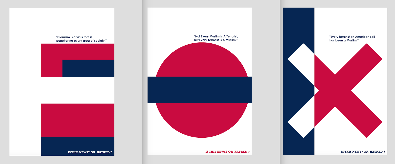
I am happy with the development of my series of posters, I feel they look far more professional that the initial development I undertook. I like the subliminal links to the FOX news logo with consistent use of typeface and colour matching my designs to the FOX logo. I think this will strengthen the link between the individual posters and the corporation. I like the modernist aesthetic of the series and think it works extremely well in creating an engaging piece of propaganda that does not conform to the graphic imagery of the genre that an audience said they had become desensitised too.
No comments:
Post a Comment