
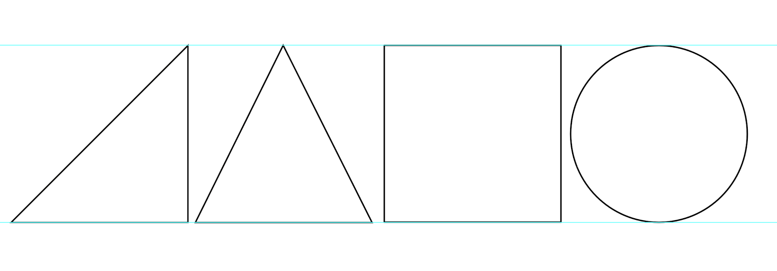
With a logo direction finalised I could then begin the development of this concept. With the geometric nature of the aesthetic I began by creating the basic shapes that all the letterforms stem from to ensure consistency within all the angles and proportions of the individual characters. From this I then began assembling the letters using a strict grid to ensure there was perfect symmetry and the chargers were as simple as possible.
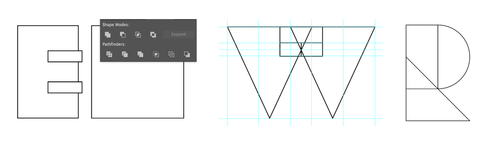
With a basic outline of the letterforms, I then refined these angles, for example where paths intersected created minimal overlaps that from a distance went unnoticed. These were corrected to ensure the quality of the resolution was as professional as possible so that the logo will look great at any scale. This gave me the first outcome of the refined logotype. With all the angles working in perfect symmetry this enhancing the simplicity aesthetic and creates a sense of consistency across all the characters which works particularly well.


Tutor Feedback:
Showing this refined design directions to my dissertation supervisor he thought the aesthetic worked well to reflect this simplicity of the brands service. Conceptually he suggested that I could have no kerning between the letterforms so they are all connected to suggest a lack of boundaries in traveling from one letter to the next. I found this concept really engaging and would elevate the design direction from purely aesthetic to have a conceptual purpose. Working with this concept I merged the characters into one form and found these worked together surprisingly well. I really liked how this gave the concept a sense of contextual understanding to critically elevate the designs meaning from aesthetic to symbolic.


No comments:
Post a Comment