Monday, 19 October 2015

OUGD501 - Study Task 2: Parody and Pastiche

My understanding from the texts is that parody is a derivative term used to describe a satirical representation of a past text whereas Pastiche is an appreciation  of a past work taking elements from this text creating a contemporary emulation creating a celebratory reference to the past. 

Hutcheon seems celebratory of parody string it reinstates a forgotten dialogue with the past that is eager to reingge with a  public form 'in using parody in the way, postmodernist forms want to work towards a public discourse that would overtly eschew modernist aestheticism and hermeticism and their attendant political self-migration' this reveals her anti-capitalistic views stating parody can be used to rejuvenate past ideas that could help to unhinge a capitalist society. 

Jameson however speaks from a marxist point of view and is critical about these forms, he states 'pastiche is like parody, the imitation of a particular or unique, idiosyncratic style, the wearing of  linguistic mask, speech in a dead language. But it is a neutral practise of such mimicry, without any of parody's ulterior motives'...'Pastiche is thus blank parody' this highlights Jamesons tone of voice with his comment 'speech in a dead language' demonstrating his marxist views that soviet should follow this new principal.

Examples of parody and pastiche can be related to graphic design with notable examples including Stranger & Stranger a company that uses pastiche of past styles to create an engaging aesthetic suitable for the products. The decadently decorated bottle designs emulate the past in a respectful tone providing a sense of resurgence that embodies these principles. 


Hutcheon, L (1989). The Politics of Postmodernism. London: Routledge. p179-p183.

Jameson, F (1991). Postmodernism, or, The Culture Logic of Late Capitalism. Durham: North Carolina: Duke University Press . p16-p25.

OUGD501 - Study Task 1: Design & Authorship

Rowland Barthes seminal text 'The Death of the Author' questions the idea of power in a new light through the philosophical questioning of the world around us. He uses the Auteur theory, which states how we must understand the author to understand the text, this paces a hierarchical value on the author over the text and Barthes disagrees with the greatly as his explains throughout the text. Barthes states we should take this power from the author and take our own meanings from a text not follow what a particular individual suggests this is enforced in the statement "language knows a 'subject', not a 'person'" (Barthes, 1977, p145). 

With regards to society Barthes invites us to take power from the these authors hinting at a capitalist society that creates experts and everyone else should listen to these ‘authors’ inducing a subservient society ruled by the expert elite. Barthes explains this further stating ‘it is discovered the prestige of the individual, of, as it is more nobly put, the ‘human person’. It is thus logical that in literature it should be this positivism, the epitome and culmination of capitalist ideology, which has attached the greatest importance to the ‘person’ of the author. (1977, p143)

This can be referenced to graphic design as there are notable ‘authors’ that are held in high regard leaving there work less vulnerable to critique but more generally accepted on the understanding of their supposed merit and respect bestowed on them by society. Names such as Massimo Vignelli are relatively unquestioned within the design society as he is portrayed as an expert to which designers adhere. This reinforcement of his prestige further creates a divide which Barthes adds allows ‘the Author remains powerful (new criticism has often done no more than consolidate it) (1977, p143)


Taking from the text this translates to the central message that we should take from a text polysemic interpretations without regard or reference to the creator. Barthes clearly states this in his powerful argument of ‘the birth of the reader must be at the cost of the death of the author’ (1977, p148) in terms of graphic design we should not adhere to a particular style or voice on the assumption it is superior or held in high regard, we should question these decisions and produce our own voice to create new perceptions of the world.

Barthes, R (1977). Image Music Text . London: Fontana Press . p142-148.

Monday, 4 May 2015

OUGD401 - END OF MODULE EVALUATION

OUGD401 - Module Evaluation


Looking at this module in retrospect I feel I have learn a great deal about the contextal side of design, this was my first time I have researched the contextual aspect of graphic deisgn in depth. Over the course of the module I feel have expanded my knowledge on a number of design related topics through a series of lectures, seminars and study tasks that will inform my practice and allow me to develop as a designer. I feel the quality of my outcome in this module is of a  extremely high quality due to the depth of my investigation research and timescale I was given to produce my resolutions. 

My research essay allowed me to devleop a hollistic knowledge of the social and political influence of graphic design.  I specialised this to appeal to my interests which made the process of research more enjoyable. Coming from a background of English Language A-level I enjoyed the process of formulating my essay however had intila difficulty with harvard referencing and my bibliography as these were new skills to me that I now feel I can use confidently within critical writing. I feel the outcome of my research essay was of a high standard as it was planned and flowed systematically. I think I remained focused throughout my essay to ensure a indepth research essay that provided a clear resolution to my hypothesis. 

I was initially apprehensive regarding the practical body of work to acompany my essay as I struggled to find a sucessful context and went through an extensive development process. I think my final design direction is informed and focused to relate back to my research essay. The aesthetic of my resolution is informed my primary research thus appealing to its audience, I am happy with my final resolution as  I feel it is concextually focused, relevent to my research essay and developed to be engagign and approprate for an audience. 

Overall I am happy with my progress through the module and my development throughout the year. I feel I have learnt an abundance of new essential skills that will be invaluable  when developing throughout the course and into my dissertation. I feel I have a much better understanding of the contextual elements of graphic design and how I can link these to my practice. I feel I  have worked well independantly through the course of this module, managing my time according and organising my own informal critiques and feedback. Due to the extended nautre of the module I have had the opportunity to extensively collate research and develop my essay to a strong professional quality andcreate a subsequent body of practical graphic design that is both relevent and focused to my research essay. 

Friday, 1 May 2015

OUGD401 - How my Practical Project links to my Research Essay

I stated in my essay that if it can be determined that propaganda has been used throughout history to deceive the people and deliberately put forth the corrupt ideologies of a small cohort, to work in that cohorts favour, these deceiving components can be isolated and prevented to ensure a more democratic society. This led me to form the hypothesis that if the state uses propaganda to enforce its own ideologies then they will deceive the people because they present biased and subjective representations of the subject matter.    Throughout the course of my essay I determined that there are substantial propagandist techniques evident within both examples of propaganda I analysed. There are subliminal examples of racism, fascism and militarism that are all encoded within the iconography presented to the people by the state. As a result of this, it can be determined that the state has used biased and subjective representations of their enemies in order to evoke a conditioned response from the people. Having identified these propagandist techniques and applied them to real life historical examples I planned to see if similar techniques that I have clearly identified as racist propaganda are still visible within todays contemporary society. I felt in modern day society news corporations have more influence than the state in influencing the people  due to increased political correctness. 

I researched FOX news as they are a world leading media organisation and found facts from CAIR (Council on American-Islamic Relations) that stated fox new are amongst the outer core of the U.S. Islamophobia Network. They published statistics by the Public Religion Research Institute that stated “There is a strong correlation between trusting Fox News and negative views of Islam and Muslims. This pattern is evident even among conservative political and religious groups.”. This suggested to me that similarly to the American propaganda I analysed Fox news also uses propaganda to enforce its own ideologies to deceive the people because they present biased and subjective representations of the subject matter (in this case Islam).  I then researched specific examples of statements made by fox news that were direct examples of propaganda similar to those used in the World War 2 American propaganda I analysed.  I analysed the following quotes made by Fox news Anchors and representatives and found them all to contain propagandist techniques. 

"Not Every Muslim Is A Terrorist, But Every Terrorist Is A Muslim."

This statement has clear use of Ad hominem as they are blatantly attacking the opponents (muslims) instead of their ideas or principles. This also use of demonising the enemy in the attempt to make the public think all muslims are terrorists. I think the clearest form of propaganda used in this statement is transfer as it is defined as 'association of an entity’s positive or negative qualities with another entity to suggest that the latter entity embodies those qualities' this clearly shows how FOX news are trying to associate the negative qualities of terrorists to muslims to sway the public opinions of muslims and make them seem dangerous. 

"Every terrorist on American soil has been a Muslim."

This statement also has clear use of propagandist techniques for example the use of Pensée unique as it represses alternative views to present the simple argument that every terrorist has been a muslim. This statements also has evidence of flag waving, the use of America, will appeal to the publics sense of nationalism and make that concerns real to an american audience making them seem directly in danger. 

"Islamism is a virus that is penetrating every area of society."

The final statement chosen uses Labelling, the use of the dysphemistic term 'virus' associated with islam is used to encourage a negative connotations by the audience. This could also be interpreted as transfer, accosting the virus with islam to deceive the public into believing islam is bad. Finally this statement is also guilty of Demonising the enemy by degenerating the appearance of islam to sway the publics opinions. 

This clearly demonstrates how FOX news use propagandist techniques to present biased and subjective representations of the subject matter to an audience, showing how these propagandist techniques are still present within todays society. I then aimed to demonstrate to an audience how we are being deceived by modern day news corporations  such as FOX news yet are blind to it, as we can see the propagandist and  racial injustice of examples throughout history (WW2) and cannot link the connections between the two.


I then created a campaign to articulate this information to the public in an accessible way as this was a problem generated from my research that the information of Fox News's alleged islamophobia was unaccessible and too time consuming to become easily educated. I think I have created a campaign that will increase public awareness in an appropriate aesthetic derived from primary research that allows the audience to draw their own conclusions and not be spooned the information, appreciating the audiences intelligence creating an engaging, thought provoking campaign. I feel I have succeeded in creating a relevant body of graphic design that will allow an audience to question why these statements are appropriate, where the same techniques used in World War 2 are openly labeled as racist. 

Thursday, 30 April 2015

OUGD401 - Print

With my final designs developed and tutors an students saying they liked the concept and aesthetic I felt confident to print my final resolution. As multiple peopled had commented on the modernist aesthetic  I chose to print my designs on matt stock as I felt this was the post approbate for a modernist production method and personally accosted gloss with a more post modern style. I also wanted my outcome to be quite sophisticated and felt personally matt stock was the best option to print on. I was happy with my final printed resolution and felt the matt stock was a good choice as it adhered to the modernist contemporary nature of the design. 


Tuesday, 28 April 2015

OUGD401 - Final Design

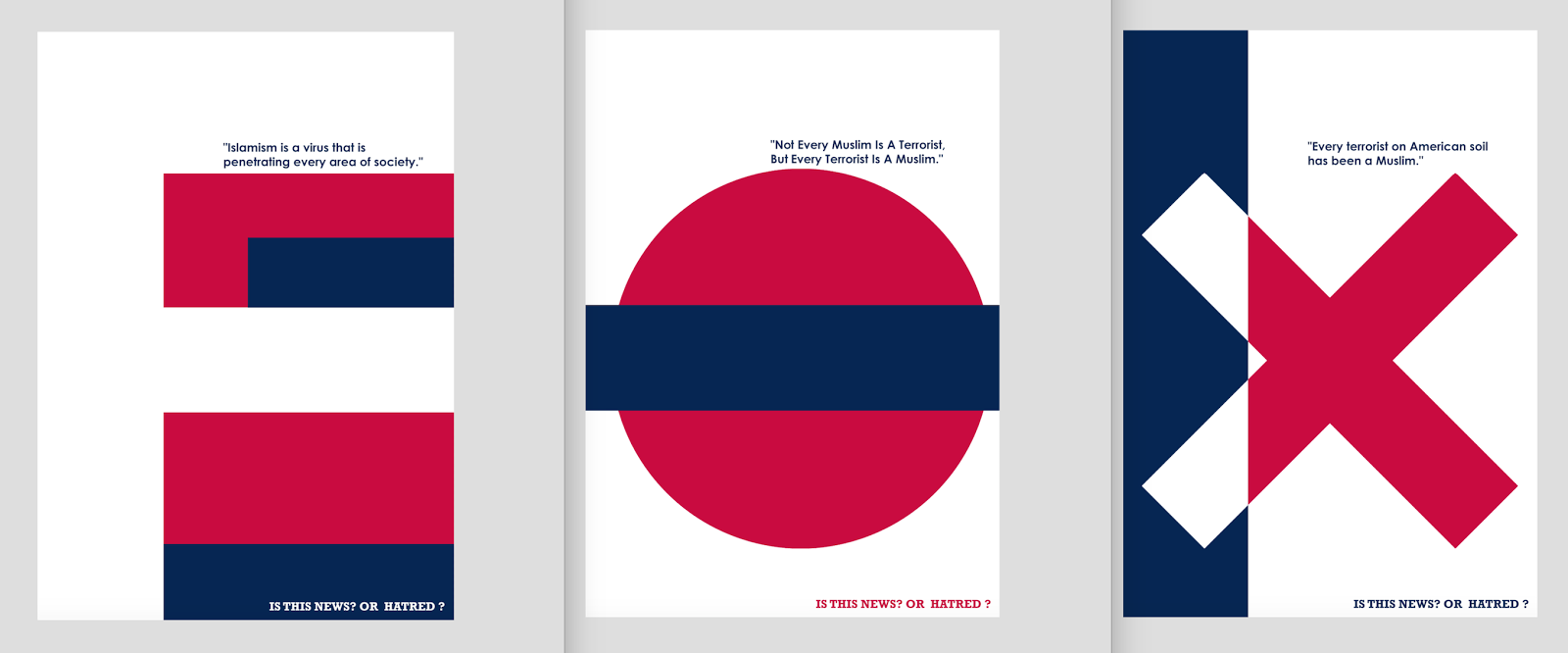
I think my final designs all work well individually and also consistently as a set.  I have used subliminal features such as consistent typefaces and colour schemes as the fox news corporation to create subliminal links to them without being too invasive and condescending. I think this works well with my concept to allow the audience to think for themselves and not be spoon fed the information. I like the creative influence I took from the MOMA series of posters to create an engaging aesthetic that again subliminal refers back to the fox news networks and the Red Wedge propaganda poster that allowed me to create a bold effective aesthetic that didn't conform to the graphic brutality of the propaganda genre that an audience told me they felt they had been desensitised to. 

I think overall I have created a successful resolution to the brief that creates a direct link to my essay. I feel my outcome solves the problem that I identified in my research that the information of Fox News's alleged islamophobia was unaccessible and too time consuming to become easily educated. I like how my essay will create an initial shock factor seeing a poster in isolation with the controversial quote subliminally referencing the FOX news network that ask the audience to question if this is acceptable.  I think I have created a campaign that will increase public awareness allowing them to draw their own conclusions from the thought provoking statement 'is this news? or propaganda? showing that ultimately these propagandist techniques that I identified in World War 2 propaganda are still being used in contemporary news yet are going relatively un-noticed. I think my resolution will succeed in raising awareness and asking people if this is acceptable to be used in contemporary society. 


OUGD401 - Tutorial Feedback

I had my final scheduled tutorial for Context of Practise, I wanted to use this time to get feedback on the development of my practical project before printing my resolution. I showed the tutor my the development of my practical resolution and explained the concept behind the work. 

He said he really liked the aesthetic and found the bold colours and shapes quite powerful. I liked this interpretation as I feel they do look strong and powerful. He liked the links with the fox news network and thought spelling out FOX across the series was a really creative resolution. He thought this could work well in a real life context and liked how  I had listened to an audience and tailored my aesthetic accordingly. 

He suggested a few minor changes such as changing the bottom slogan from 'is this news? or hatred?' to 'Is this news? or Propaganda?' as he felt this would relate it more directly back to the essay as  I was researching how propagandist techniques were used so they practical should show how fox news use similar propagandist techniques. I feel this was a good suggestion as it refers the practical project more directly back to my essay, which will hopefully create a more successful outcome.


Monday, 27 April 2015

OUGD401 - Development; Aesthetic

I wanted to improve the overall aesthetic of my designs as I was not confident they were as strong as they could be, I started by developing each design individually then seeing how they worked as a set. I wanted to create continuity between all of my designs so when put together they work well as a set. having said that I needed each poster to be strong and work individually with the bold colours and strong shapes working together to engage an audience. 

I started with the 'X' design, I placed a blue strip down the left side to beak up the image and prevent it from being a fully white background, I then inverted the intersecting part of the X to create a dramatic contrast that will catch the eye of an audience. I like the small point size of the text as the abstract ambiguity of the deign will make an audience want to look closer and read the information. I felt this design worked well as a stand alone poster and wanted to create similar bold designs that would work together and individually. 

I then developed the 'F' design, I used rectangles and negative space to form the F which I felt worked well, I made the rectangles first sizes to keep an abstract quality to my designs and engage an audience throughout the varying shapes and contrasting colours. To make the design more consistent to the other X design I adjusted the width the of the vertical white space to match the vertical blue column of X, I thought this worked better creating more continuity between the design allowing for a cleaner overall aesthetic. 

I struggled with the 'O' design initially as I lacked inspiration. Designing the other two helped me as I could use similar features to create a range of consistent designs. I started by extending the bottom blue rectangle from the F design onto along onto the O design as I liked this overlapping feature within the MOMA series of posters, I then took this further using the ligature of the F and extending it onto the O design, I inverted this to contrast the red circle and make the design more detailed as  I felt it was too simplistic. Finally I extended the ligature rectangle across the full width of the O poster, I think this worked well in breaking up the design and creating continuity across the set. 


I am happy with the development of my series of posters, I feel they look far more professional that the initial development I undertook. I like the subliminal links to the FOX news logo with consistent use of typeface and colour matching my designs to the FOX logo. I think this will strengthen the link between the individual posters and the corporation. I like the modernist aesthetic of the series and think it works extremely well in creating an engaging piece of propaganda that does not conform to the graphic imagery of the genre that an audience said they had become desensitised too. 

OUGD401 - Development; Colour

My initial development featured the prominent red white and blue colour scheme of the FOX news as well as adding subtle propagandist techniques to the aesthetic of the posters using flag waving, This would appeal to the audiences nationalism. I started to develop my designs further and felt the aesthetic wasn't quite right, trying to resolve this I experimented with tonal variations of the red white and blue before coming up with the idea to further subliminally reference fox news within my designs by pantone colour matching my designs with the fox news logo. 

I felt this would create further subliminal links between my posters and the FOX news network as well as softening the colour palette that was currently quite garish. I started by matching the colours to the fox news logo I found that the blue was 'Pantone 655C' and the red was 'Pantone 192C' I then planned to match my designs to these colours to see the colour treatment was more suitable. I liked how I have create a range of subtle links to the FOX news network without creating a 'witch hunt'. 


I sampled this new colour palette on the same design and presented these colour variations to a range of students. I didn't tell them I had colour matched from the Fox logo until they had given me their feedback. I found that most students told me they preferred the colour treatment that matched the FOX news colour scheme as they told me is was more subtle and softer on the eye yet still bold enough to stand out, one student said 'they complement each other better.' I agreed that the Pantoned colours work better creating a less garish aesthetic that is still bold and engaging and had subliminal links to the FOX news branding. 

OUGD401 - Development; Typography

I wanted to use appropriate typography throughout my practical resolution, As many students said my design direction had a very modernist aesthetic I considered using Helvetica as it fits this modernist aesthetic well and is clearly legible so would be easy for an audience to read quickly and at a distance. After further research I found that Fox News channel uses Century Gothic for its graphics, as some students failed to make the initial connection to fox news when placed as a series I thought I could strengthen this connection by including the same typeface they corporation uses to further subliminally reference the posters back to them. I think this typeface works well as it is still a strong simple sans-serif typeface that is clearly legible and links back the context of my outcome. 


I wanted to use a bolder typeface for my question at the bottom of each poster, I felt a heavier weight slab serif typeface would draw the eye of the audience and make the statement seem more important. I experimented with a range of slab serifs ultimately choosing Rockwell Bold. I think this type treatment is appropriate because it makes a bold presence within the design which is important as it is placed in the bottom corner that may have been overlooked by an audience if set in a lighter typeface. I think this works well in contrasting Century Gothic and stressing a sense of importance to the statement 'is this news? or hatred?'

OUGD401 - Student Feedback

I showed a range of students my initial development for my practical project to get their feedback before further developing my design. I was slightly apprehensive as I knew there was a lot more development to be done but wanted their initial feedback as to whether they felt this design direction would be successful. I was surprised to see that a lot of students really liked this design direction, they said it was very modernist and abstract for propaganda which actually made it more engaging. 

A number of students commented on how they liked the question at the bottom of the posters, comments included 'its cool that your asking people to choose for themselves' and 'its nice not being told what to think for a change' this was the concept I was going for so was extremely pleased people noticed this. I was surprised at the number of people that didn't notice the series spelt out fox until I told them, they were almost shocked then when they knew about it could see it clearly. I really liked this as it shows it is subliminal and will subtly relate the quotes back to FOX news but will allow people to see the quotes in isolation and decide if they are islamophobic without the legitimacy of FOX news corporation clouding their judgement. I am very happy with the response students had to my design direction I will now further develop the aesthetic to make it strong bold and engaging. 

Sunday, 26 April 2015

OUGD401 - Initial Development

I created some quick digital developments of my initial sketches to show a range of students before further developing this design direction. I used rectangles and negative space to form the 'F' and bold circles and 'x' to spell out fox. I included a different quote in each design to make each poster individual but they come together to work as a set. 

I have included the question at the bottom of every posters 'is the news? or hatred?' I think this will work extremely well as it asked the audience to decide their own personal opinion. I feel this poster series works well in creating an engaging design throughout the bold statements, bolder colour and abstract shapes that come together to subliminally spell out FOX this refers it back to the fox news network. 

Know there is a lot more development to be undertaken however I feel this initial development show the style I am trying to portray. I will ask a range of students for their feedback before further developing my design into a more sophisticated concept. 


OUGD401 - Content

My design direction is a series of three posters each with a different controversial quote made by fox news regarding islamophobic content. I feel this will make my practical specific and engaging, it also links directly back to the american propaganda I analysed in my essay which shows clear use of racial propaganda. My aim for the outcome is to be able to articulate to the public how FOX news uses similar propagandist techniques yet is socially acceptable where we can clearly identify the use of american world war 2 propaganda as racist. 

I have already researched a range of quotes for the content of my practical project however need to narrow it down to 3 quotes that I can use in my posters. I cross referenced these quotes to the propagandist techniques I researched in my essay to select the most successful examples of propaganda. 

On the June 6, 2012, edition of Fox News' The Five, host Eric Bolling advocated for police surveillance of Muslims and falsely claimed that "every terrorist on American soil has been a Muslim." [Fox News, The Five6/6/12]

On the October 15, 2010, edition of Fox News Radio's Kilmeade & Friends, host Kilmeade defended his Fox colleague Bill O'Reilly's statement that "all terrorists are Muslim," asserting that "Not every Muslim is an extremist, a terrorist, but every terrorist is a Muslim. You can't avoid that fact." [Fox News Radio, Kilmeade & Friends10/15/10

On the August 14, 2013 edition of FoxNews.com's DEFCON 3, network contributor Cal Thomas warned that although Muslims "seem very peaceful," the Quran requires them "to lie to infidels like the rest of us," and said that "Islamism is a virus," that "is penetrating every area of society." [FoxNews.com, DEFCON 3, 8/14/13]


"Not Every Muslim Is A Terrorist, But Every Terrorist Is A Muslim."

This statement has clear use of Ad hominem as they are blatantly attacking the opponents (muslims) instead of their ideas or principles. This also use of demonising the enemy in the attempt to make the public think all muslims are terrorists. I think the clearest form of propaganda used in this statement is transfer as it is defined as 'association of an entity’s positive or negative qualities with another entity to suggest that the latter entity embodies those qualities' this clearly shows how FOX news are trying to associate the negative qualities of terrorists to muslims to sway the public opinions of muslims and make them seem dangerous. 

"Every terrorist on American soil has been a Muslim."

This statement also has clear use of propagandist techniques for example the use of Pensée unique as it represses alternative views to present the simple argument that every terrorist has been a muslim. This statements also has evidence of flag waving, the use of America, will appeal to the publics sense of nationalism and make that concerns real to an american audience making them seem directly in danger. 

"Islamism is a virus that is penetrating every area of society."

The final statement chosen uses Labelling, the use of the dysphemistic term 'virus' associated with islam is used to encourage a negative connotations by the audience. This could also be interpreted as transfer, accosting the virus with islam to deceive the public into believing islam is bad. Finally this statement is also guilty of Demonising the enemy by degenerating the appearance of islam to sway the publics opinions. 

Having identified the propagandist techniques within these statements I feel confident that the content of my practical project is specific to my concept links to my essay which will hopefully create a successful resolution to the brief.